Grain Coffee
From template to a coffee brand people remember
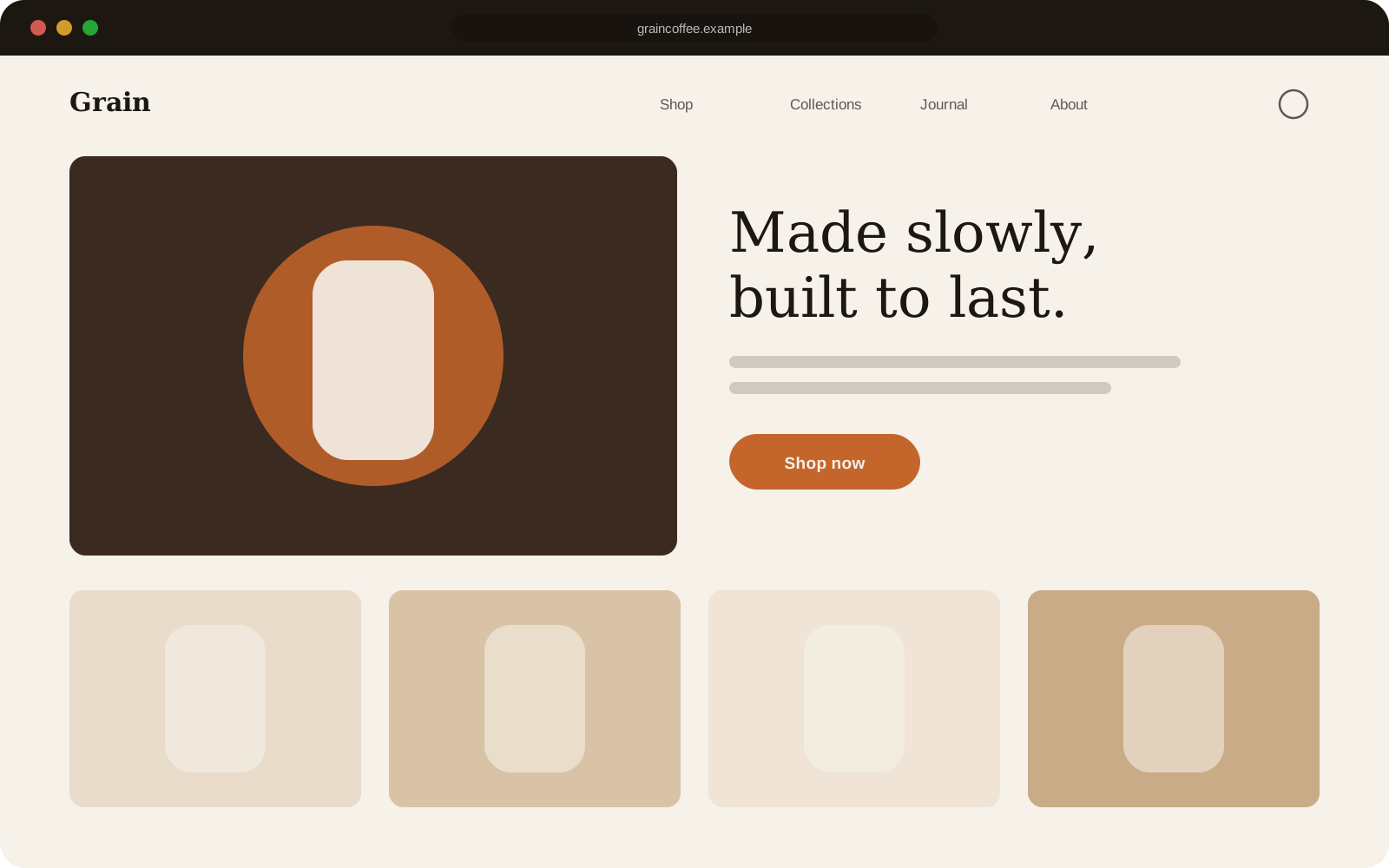
A redesign for a small-batch roaster whose store looked like a default theme. New identity on the page, a subscription-first homepage, and a cleaner checkout path.
Sample project: placeholder content
- Industry
- Food & drink
- Services
- Store redesign, Subscriptions, Conversion work
- Live site
- Private
- Subscription sign-ups
- +41%
- Cart abandonment
- −22%
The brief
Great coffee, forgettable store. Grain wanted the site to feel like their packaging and to push customers towards subscriptions.
What we did
We moved subscriptions to the top of the homepage, rewrote the product pages around taste notes rather than specs, and cut two steps out of the path to checkout.
This is a sample project used to show the layout. Replace it with your own work in the CMS.
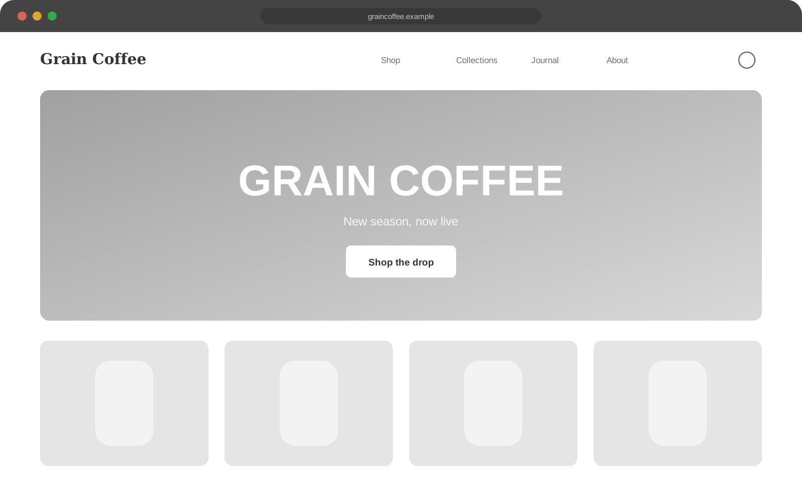
Before and after
Drag the handle to compare.
 BeforeAfter